Boho Corner
Lifestyle
Overview
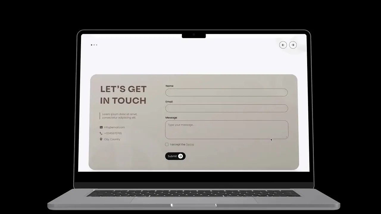
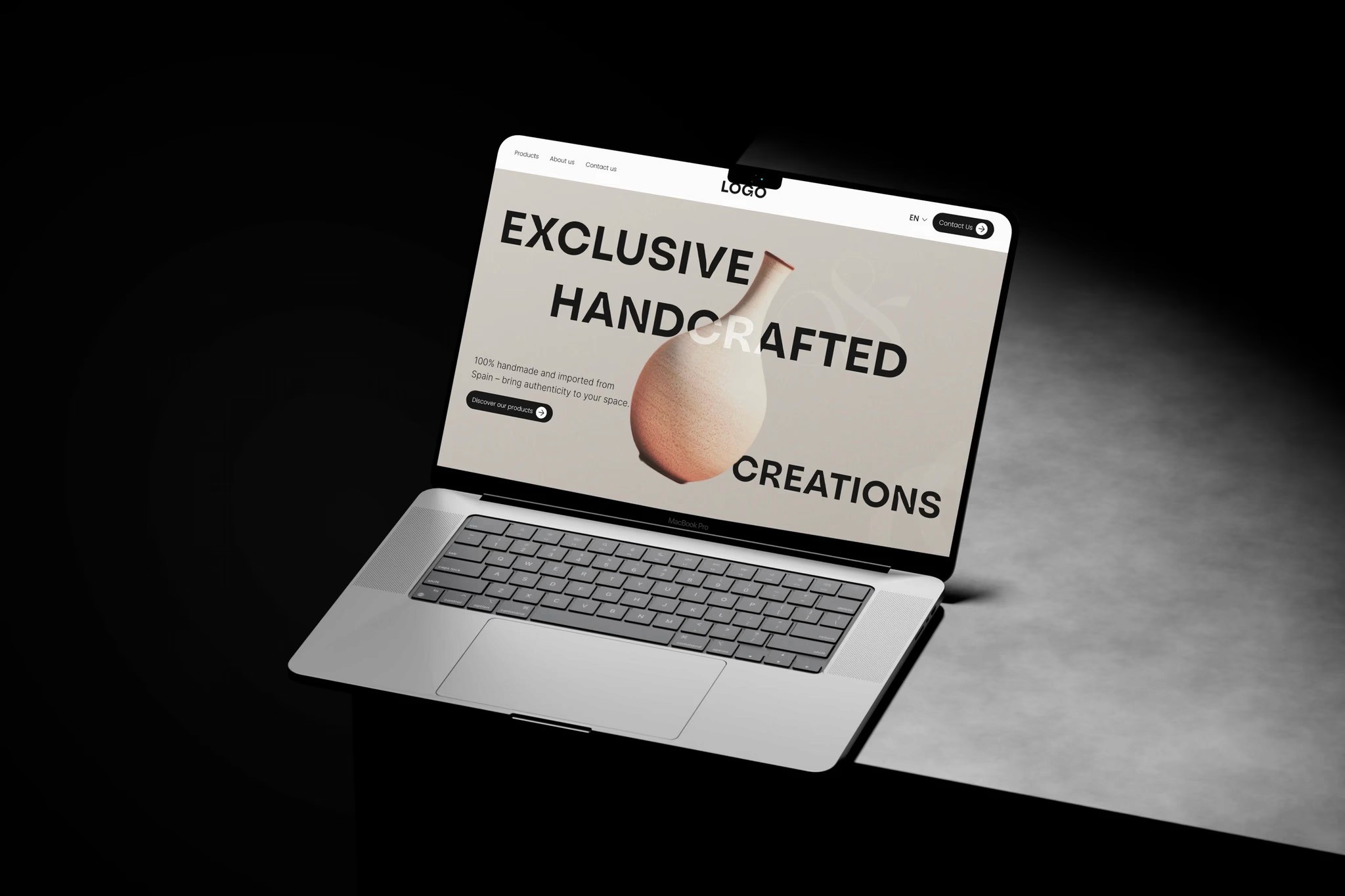
Boho Corner is a showcase landing page designed to present a curated collection of handmade interior pieces.
The goal was not to create a shopping experience, but a visual space that reflects the brand’s aesthetic and highlights the products in a calm and intentional way.
Instead of focusing on transactions, the project focuses on presentation, perception, and storytelling.
The problem
The challenge was not how to sell products, but how to present them in a way that reflects their value.
A typical website structure with grids, filters, and multiple pages would make the brand feel generic and dilute its identity.
At the same time, the page still needed to communicate enough information to support client conversations and interest.
traditional layouts didn’t match the brand’s aesthetic
too much structure would break the visual experience
products needed to feel curated, not массово presented
the page had to stay simple but still informative
the experience needed to support presentation, not transactions
The goal
The goal was to create a calm, scroll-based experience that feels more like a curated presentation than a website.
Instead of optimizing for clicks or actions, the focus was on how users move through the page and how products are perceived.
create a strong visual identity through layout and imagery
guide users through a smooth, linear experience
highlight products without overwhelming the page
keep the structure minimal and easy to follow
support brand perception and storytelling
My Role
I worked on this project end-to-end, from concept and visual direction to final UI design.
I defined the overall structure, created moodboards, and designed how products are presented across the page. I also designed the full layout for desktop and mobile and prepared the project for handoff.
The goal was to create a cohesive visual experience that reflects the brand and feels intentional in every detail.
Outcome
The result is a landing page that works as a visual presentation of the brand.
Instead of a functional website, it becomes a tool for showcasing products and communicating the brand’s aesthetic and values.
The design helps position the brand as curated and intentional, while keeping the experience simple and focused.
More Works


FAQ
Frequently Asked Questions
01
What services do you offer?
02
What’s your design process?
03
How long does a project usually take?
04
Can I see updates throughout the design process?
05
What design tools do you use?
06
How do we start working together?
Boho Corner
Lifestyle
Overview
Boho Corner is a showcase landing page designed to present a curated collection of handmade interior pieces.
The goal was not to create a shopping experience, but a visual space that reflects the brand’s aesthetic and highlights the products in a calm and intentional way.
Instead of focusing on transactions, the project focuses on presentation, perception, and storytelling.
The problem
The challenge was not how to sell products, but how to present them in a way that reflects their value.
A typical website structure with grids, filters, and multiple pages would make the brand feel generic and dilute its identity.
At the same time, the page still needed to communicate enough information to support client conversations and interest.
traditional layouts didn’t match the brand’s aesthetic
too much structure would break the visual experience
products needed to feel curated, not массово presented
the page had to stay simple but still informative
the experience needed to support presentation, not transactions
The goal
The goal was to create a calm, scroll-based experience that feels more like a curated presentation than a website.
Instead of optimizing for clicks or actions, the focus was on how users move through the page and how products are perceived.
create a strong visual identity through layout and imagery
guide users through a smooth, linear experience
highlight products without overwhelming the page
keep the structure minimal and easy to follow
support brand perception and storytelling
My Role
I worked on this project end-to-end, from concept and visual direction to final UI design.
I defined the overall structure, created moodboards, and designed how products are presented across the page. I also designed the full layout for desktop and mobile and prepared the project for handoff.
The goal was to create a cohesive visual experience that reflects the brand and feels intentional in every detail.
Outcome
The result is a landing page that works as a visual presentation of the brand.
Instead of a functional website, it becomes a tool for showcasing products and communicating the brand’s aesthetic and values.
The design helps position the brand as curated and intentional, while keeping the experience simple and focused.
More Works
FAQ
Frequently Asked Questions
01
What services do you offer?
02
What’s your design process?
03
How long does a project usually take?
04
Can I see updates throughout the design process?
05
What design tools do you use?
06
How do we start working together?
Boho Corner
Lifestyle
Overview
Boho Corner is a showcase landing page designed to present a curated collection of handmade interior pieces.
The goal was not to create a shopping experience, but a visual space that reflects the brand’s aesthetic and highlights the products in a calm and intentional way.
Instead of focusing on transactions, the project focuses on presentation, perception, and storytelling.
The problem
The challenge was not how to sell products, but how to present them in a way that reflects their value.
A typical website structure with grids, filters, and multiple pages would make the brand feel generic and dilute its identity.
At the same time, the page still needed to communicate enough information to support client conversations and interest.
traditional layouts didn’t match the brand’s aesthetic
too much structure would break the visual experience
products needed to feel curated, not массово presented
the page had to stay simple but still informative
the experience needed to support presentation, not transactions
The goal
The goal was to create a calm, scroll-based experience that feels more like a curated presentation than a website.
Instead of optimizing for clicks or actions, the focus was on how users move through the page and how products are perceived.
create a strong visual identity through layout and imagery
guide users through a smooth, linear experience
highlight products without overwhelming the page
keep the structure minimal and easy to follow
support brand perception and storytelling
My Role
I worked on this project end-to-end, from concept and visual direction to final UI design.
I defined the overall structure, created moodboards, and designed how products are presented across the page. I also designed the full layout for desktop and mobile and prepared the project for handoff.
The goal was to create a cohesive visual experience that reflects the brand and feels intentional in every detail.
Outcome
The result is a landing page that works as a visual presentation of the brand.
Instead of a functional website, it becomes a tool for showcasing products and communicating the brand’s aesthetic and values.
The design helps position the brand as curated and intentional, while keeping the experience simple and focused.
More Works
FAQ
Frequently Asked Questions
02
What’s your design process?
01
What services do you offer?
03
How long does a project usually take?
04
Can I see updates throughout the design process?
05
What design tools do you use?
06
How do we start working together?