
Boosthive
Gaming Services
Overview
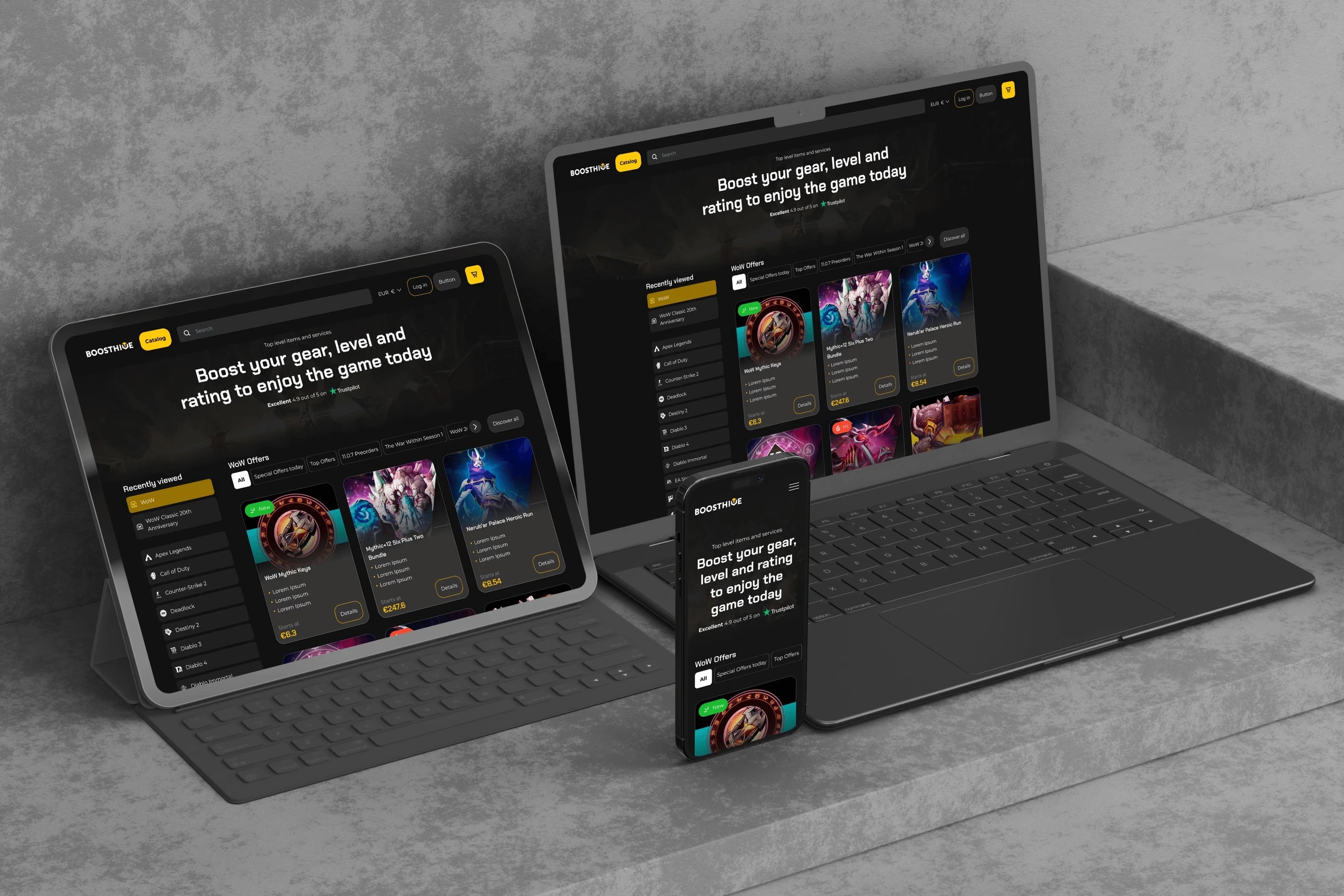
BoostHive is a professional game boosting platform offering services for games like World of Warcraft, Destiny 2, and other popular MMOs.
Despite having a strong presence in the niche, the platform had an outdated interface and a confusing user experience that didn’t reflect the quality of the service.
The goal was not just to refresh the visuals, but to redesign the experience in a way that builds trust, simplifies decision-making, and improves conversion.
The problem
The core issue was not aesthetics, it was trust and usability.
Users were landing on the platform but dropping off before completing a purchase. The experience felt overwhelming, unclear, and inconsistent with expectations of a premium service.
information was overloaded and poorly structured
users were presented with too many options at once
checkout flow was complex and hard to follow
the interface didn’t feel trustworthy or modern
mobile experience was especially weak, leading to higher drop-offs
The goal
The goal was to simplify the experience and make it easier for users to move from interest to purchase.
Instead of adding more features, the focus was on reducing friction and guiding users through the process in a clear and predictable way.
improve clarity and reduce cognitive load
simplify the purchase and checkout flow
build trust through a more consistent and modern UI
create a scalable system for future features
My Role
I worked on this project as a UI/UX designer, focusing on improving clarity, structure, and overall usability.
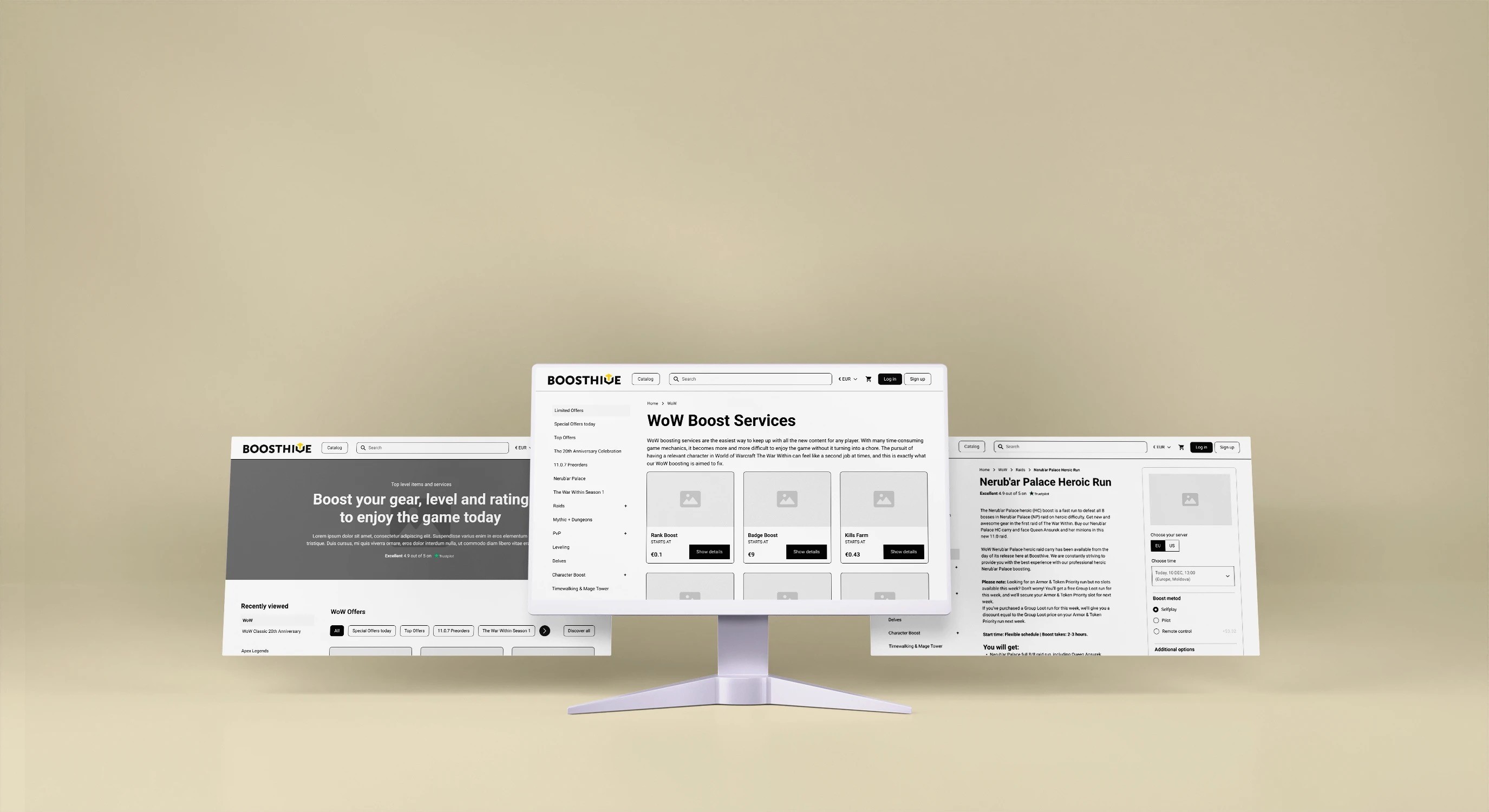
While the initial request was visual redesign, the process quickly revealed deeper issues in the user experience. I conducted a UX audit, identified key friction points, and proposed improvements to the structure and checkout flow.
My work included redesigning key screens, simplifying interactions, and building a consistent design system that could support future development.
Outcome
The redesigned experience reduces friction and makes the purchase flow easier to complete.
By simplifying the structure and guiding users through decisions step by step, the platform becomes easier to understand and navigate. This helps build trust and lowers the chances of users dropping off during key moments.
Even though the project is currently on hold, the redesign provides a strong foundation for future development, including a clear user flow, scalable design system, and a more modern and conversion-focused experience.
More Works


FAQ
Frequently Asked Questions
01
What services do you offer?
02
What’s your design process?
03
How long does a project usually take?
04
Can I see updates throughout the design process?
05
What design tools do you use?
06
How do we start working together?
Boosthive
Gaming Services
Overview
BoostHive is a professional game boosting platform offering services for games like World of Warcraft, Destiny 2, and other popular MMOs.
Despite having a strong presence in the niche, the platform had an outdated interface and a confusing user experience that didn’t reflect the quality of the service.
The goal was not just to refresh the visuals, but to redesign the experience in a way that builds trust, simplifies decision-making, and improves conversion.
The problem
The core issue was not aesthetics, it was trust and usability.
Users were landing on the platform but dropping off before completing a purchase. The experience felt overwhelming, unclear, and inconsistent with expectations of a premium service.
information was overloaded and poorly structured
users were presented with too many options at once
checkout flow was complex and hard to follow
the interface didn’t feel trustworthy or modern
mobile experience was especially weak, leading to higher drop-offs
The goal
The goal was to simplify the experience and make it easier for users to move from interest to purchase.
Instead of adding more features, the focus was on reducing friction and guiding users through the process in a clear and predictable way.
improve clarity and reduce cognitive load
simplify the purchase and checkout flow
build trust through a more consistent and modern UI
create a scalable system for future features
My Role
I worked on this project as a UI/UX designer, focusing on improving clarity, structure, and overall usability.
While the initial request was visual redesign, the process quickly revealed deeper issues in the user experience. I conducted a UX audit, identified key friction points, and proposed improvements to the structure and checkout flow.
My work included redesigning key screens, simplifying interactions, and building a consistent design system that could support future development.
Outcome
The redesigned experience reduces friction and makes the purchase flow easier to complete.
By simplifying the structure and guiding users through decisions step by step, the platform becomes easier to understand and navigate. This helps build trust and lowers the chances of users dropping off during key moments.
Even though the project is currently on hold, the redesign provides a strong foundation for future development, including a clear user flow, scalable design system, and a more modern and conversion-focused experience.
More Works
FAQ
Frequently Asked Questions
01
What services do you offer?
02
What’s your design process?
03
How long does a project usually take?
04
Can I see updates throughout the design process?
05
What design tools do you use?
06
How do we start working together?
Boosthive
Gaming Services
Overview
BoostHive is a professional game boosting platform offering services for games like World of Warcraft, Destiny 2, and other popular MMOs.
Despite having a strong presence in the niche, the platform had an outdated interface and a confusing user experience that didn’t reflect the quality of the service.
The goal was not just to refresh the visuals, but to redesign the experience in a way that builds trust, simplifies decision-making, and improves conversion.
The problem
The core issue was not aesthetics, it was trust and usability.
Users were landing on the platform but dropping off before completing a purchase. The experience felt overwhelming, unclear, and inconsistent with expectations of a premium service.
information was overloaded and poorly structured
users were presented with too many options at once
checkout flow was complex and hard to follow
the interface didn’t feel trustworthy or modern
mobile experience was especially weak, leading to higher drop-offs
The goal
The goal was to simplify the experience and make it easier for users to move from interest to purchase.
Instead of adding more features, the focus was on reducing friction and guiding users through the process in a clear and predictable way.
improve clarity and reduce cognitive load
simplify the purchase and checkout flow
build trust through a more consistent and modern UI
create a scalable system for future features
My Role
I worked on this project as a UI/UX designer, focusing on improving clarity, structure, and overall usability.
While the initial request was visual redesign, the process quickly revealed deeper issues in the user experience. I conducted a UX audit, identified key friction points, and proposed improvements to the structure and checkout flow.
My work included redesigning key screens, simplifying interactions, and building a consistent design system that could support future development.
Outcome
The redesigned experience reduces friction and makes the purchase flow easier to complete.
By simplifying the structure and guiding users through decisions step by step, the platform becomes easier to understand and navigate. This helps build trust and lowers the chances of users dropping off during key moments.
Even though the project is currently on hold, the redesign provides a strong foundation for future development, including a clear user flow, scalable design system, and a more modern and conversion-focused experience.
More Works
FAQ
Frequently Asked Questions
02
What’s your design process?
01
What services do you offer?
03
How long does a project usually take?
04
Can I see updates throughout the design process?
05
What design tools do you use?
06
How do we start working together?