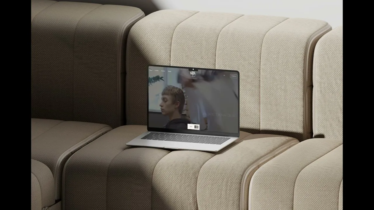

SMPL Project
Lifestyle
Overview
SMPL is a physical space that combines a modern barbershop and a specialty coffee shop under one brand.
The challenge was to design a clean, minimal landing page that clearly separates the two services while still feeling like a single, cohesive experience.
The goal was to create a website that reflects the atmosphere of the space, refined, modern, and intentional, without relying on typical “barbershop” or “coffee” visual clichés.
The problem
The space has two distinct directions, but the website needed to present them as one concept.
If combined too closely, the experience becomes confusing. If separated too much, the brand loses its identity.
At the same time, the design had to stay minimal and not rely on heavy visuals or obvious stylistic cues.
two different services competing for attention
risk of visual inconsistency
need to clearly communicate both directions
minimal design leaves less room for mistakes
balance between separation and unity
The goal
The goal was to create a clear and structured landing page that introduces both services without overwhelming the user.
Instead of treating them as separate products, the experience needed to guide users naturally between them.
clearly separate barbershop and coffee directions
maintain a unified visual identity
create a smooth and intuitive scroll flow
keep the design minimal but expressive
reflect the tone of the physical space

My Role
I focused on defining how both services are presented within a single page.
The main challenge was to keep them clearly separated without breaking the overall identity, so most of my work was around structure, layout decisions, and visual balance.
I designed the page in a way where each direction has its own presence, but still feels like part of one cohesive system.
Outcome
The result is a landing page that clearly communicates both sides of the brand without feeling fragmented.
Users can easily understand the concept, navigate the content, and get a sense of the space before visiting it.
The design reflects the tone of the physical location and supports the brand’s positioning as modern, minimal, and intentional.
More Works


FAQ
Frequently Asked Questions
01
What services do you offer?
02
What’s your design process?
03
How long does a project usually take?
04
Can I see updates throughout the design process?
05
What design tools do you use?
06
How do we start working together?
SMPL Project
Lifestyle
Overview
SMPL is a physical space that combines a modern barbershop and a specialty coffee shop under one brand.
The challenge was to design a clean, minimal landing page that clearly separates the two services while still feeling like a single, cohesive experience.
The goal was to create a website that reflects the atmosphere of the space, refined, modern, and intentional, without relying on typical “barbershop” or “coffee” visual clichés.
The problem
The space has two distinct directions, but the website needed to present them as one concept.
If combined too closely, the experience becomes confusing. If separated too much, the brand loses its identity.
At the same time, the design had to stay minimal and not rely on heavy visuals or obvious stylistic cues.
two different services competing for attention
risk of visual inconsistency
need to clearly communicate both directions
minimal design leaves less room for mistakes
balance between separation and unity
The goal
The goal was to create a clear and structured landing page that introduces both services without overwhelming the user.
Instead of treating them as separate products, the experience needed to guide users naturally between them.
clearly separate barbershop and coffee directions
maintain a unified visual identity
create a smooth and intuitive scroll flow
keep the design minimal but expressive
reflect the tone of the physical space
My Role
I focused on defining how both services are presented within a single page.
The main challenge was to keep them clearly separated without breaking the overall identity, so most of my work was around structure, layout decisions, and visual balance.
I designed the page in a way where each direction has its own presence, but still feels like part of one cohesive system.
Outcome
The result is a landing page that clearly communicates both sides of the brand without feeling fragmented.
Users can easily understand the concept, navigate the content, and get a sense of the space before visiting it.
The design reflects the tone of the physical location and supports the brand’s positioning as modern, minimal, and intentional.
More Works
FAQ
Frequently Asked Questions
01
What services do you offer?
02
What’s your design process?
03
How long does a project usually take?
04
Can I see updates throughout the design process?
05
What design tools do you use?
06
How do we start working together?
SMPL Project
Lifestyle
Overview
SMPL is a physical space that combines a modern barbershop and a specialty coffee shop under one brand.
The challenge was to design a clean, minimal landing page that clearly separates the two services while still feeling like a single, cohesive experience.
The goal was to create a website that reflects the atmosphere of the space, refined, modern, and intentional, without relying on typical “barbershop” or “coffee” visual clichés.
The problem
The space has two distinct directions, but the website needed to present them as one concept.
If combined too closely, the experience becomes confusing. If separated too much, the brand loses its identity.
At the same time, the design had to stay minimal and not rely on heavy visuals or obvious stylistic cues.
two different services competing for attention
risk of visual inconsistency
need to clearly communicate both directions
minimal design leaves less room for mistakes
balance between separation and unity
The goal
The goal was to create a clear and structured landing page that introduces both services without overwhelming the user.
Instead of treating them as separate products, the experience needed to guide users naturally between them.
clearly separate barbershop and coffee directions
maintain a unified visual identity
create a smooth and intuitive scroll flow
keep the design minimal but expressive
reflect the tone of the physical space
My Role
I focused on defining how both services are presented within a single page.
The main challenge was to keep them clearly separated without breaking the overall identity, so most of my work was around structure, layout decisions, and visual balance.
I designed the page in a way where each direction has its own presence, but still feels like part of one cohesive system.
Outcome
The result is a landing page that clearly communicates both sides of the brand without feeling fragmented.
Users can easily understand the concept, navigate the content, and get a sense of the space before visiting it.
The design reflects the tone of the physical location and supports the brand’s positioning as modern, minimal, and intentional.
More Works
FAQ
Frequently Asked Questions
02
What’s your design process?
01
What services do you offer?
03
How long does a project usually take?
04
Can I see updates throughout the design process?
05
What design tools do you use?
06
How do we start working together?