
TMICC
Cybersecurity
Overview
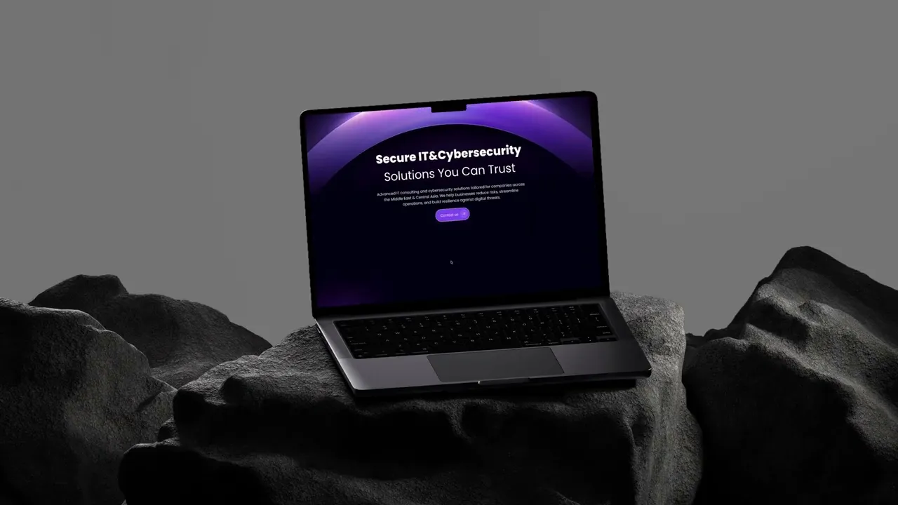
TMICC is a company specializing in IT services and cybersecurity solutions. The goal of the project was to design a modern corporate website that clearly presents the company’s services and expertise while maintaining a professional and trustworthy appearance.
The website needed to communicate technical information in a way that is easy to understand for potential clients. The design focuses on clarity, structured layouts, and a clean visual style that reflects the technological nature of the company.
The result is a website that highlights the company’s services while providing visitors with a straightforward and accessible browsing experience.
The problem
The main difficulty was making complex services understandable at a glance.
The content itself was detailed, but without a clear structure it required effort to process. For users unfamiliar with technical terminology, it was hard to quickly понять, что именно делает компания и чем она отличается.
There was also a need to stay visually aligned with related brands, which added constraints to how the interface could look.
services were described in a way that required too much reading
no clear separation between different offerings
users had to interpret information instead of scanning it
weak visual hierarchy made content harder to navigate
brand alignment limited visual freedom
The goal
The goal was to make the website easier to read and quicker to understand.
Instead of simplifying the content itself, the focus was on presenting it in a more structured and accessible way.
organize services into clear, distinct sections
make key information visible without deep reading
improve readability through layout and hierarchy
keep the design aligned with the brand ecosystem
create a more confident and professional impression
My Role
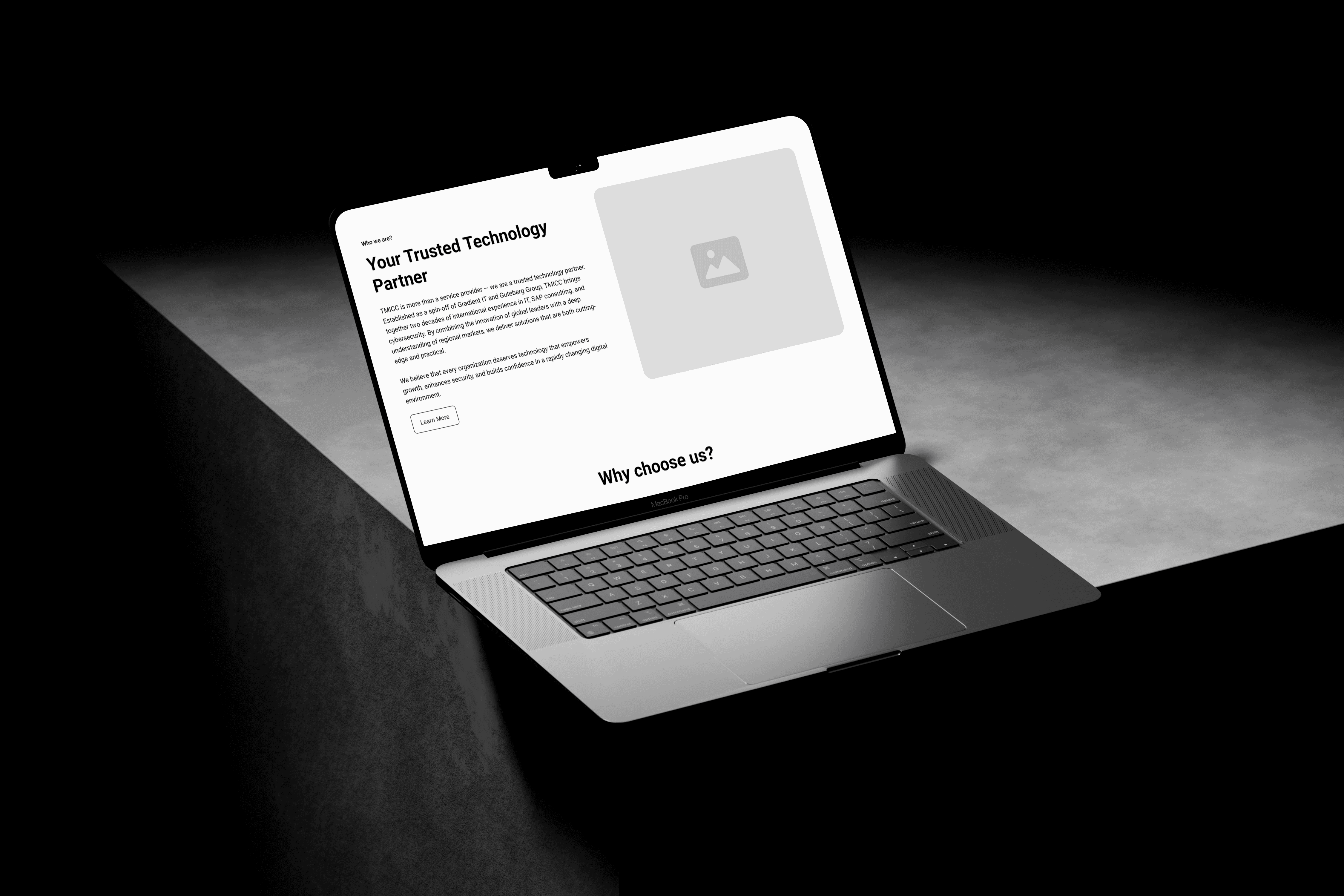
I built the website from the ground up, starting with defining how the company’s services should be structured and presented.
The focus was on organizing the content, shaping the page logic, and creating a visual direction that supports clarity while staying consistent with the brand.
Outcome
The result is a website that communicates the company’s services more clearly and effectively.
Users can quickly understand what the company offers and move through the content without confusion. The structured layout improves readability and makes the experience feel more reliable.
The project provides a solid foundation for further development and expansion.
More Works


FAQ
Frequently Asked Questions
01
What services do you offer?
02
What’s your design process?
03
How long does a project usually take?
04
Can I see updates throughout the design process?
05
What design tools do you use?
06
How do we start working together?
TMICC
Cybersecurity
Overview
TMICC is a company specializing in IT services and cybersecurity solutions. The goal of the project was to design a modern corporate website that clearly presents the company’s services and expertise while maintaining a professional and trustworthy appearance.
The website needed to communicate technical information in a way that is easy to understand for potential clients. The design focuses on clarity, structured layouts, and a clean visual style that reflects the technological nature of the company.
The result is a website that highlights the company’s services while providing visitors with a straightforward and accessible browsing experience.
The problem
The main difficulty was making complex services understandable at a glance.
The content itself was detailed, but without a clear structure it required effort to process. For users unfamiliar with technical terminology, it was hard to quickly понять, что именно делает компания и чем она отличается.
There was also a need to stay visually aligned with related brands, which added constraints to how the interface could look.
services were described in a way that required too much reading
no clear separation between different offerings
users had to interpret information instead of scanning it
weak visual hierarchy made content harder to navigate
brand alignment limited visual freedom
The goal
The goal was to make the website easier to read and quicker to understand.
Instead of simplifying the content itself, the focus was on presenting it in a more structured and accessible way.
organize services into clear, distinct sections
make key information visible without deep reading
improve readability through layout and hierarchy
keep the design aligned with the brand ecosystem
create a more confident and professional impression
My Role
I built the website from the ground up, starting with defining how the company’s services should be structured and presented.
The focus was on organizing the content, shaping the page logic, and creating a visual direction that supports clarity while staying consistent with the brand.
Outcome
The result is a website that communicates the company’s services more clearly and effectively.
Users can quickly understand what the company offers and move through the content without confusion. The structured layout improves readability and makes the experience feel more reliable.
The project provides a solid foundation for further development and expansion.
More Works
FAQ
Frequently Asked Questions
01
What services do you offer?
02
What’s your design process?
03
How long does a project usually take?
04
Can I see updates throughout the design process?
05
What design tools do you use?
06
How do we start working together?
TMICC
Cybersecurity
Overview
TMICC is a company specializing in IT services and cybersecurity solutions. The goal of the project was to design a modern corporate website that clearly presents the company’s services and expertise while maintaining a professional and trustworthy appearance.
The website needed to communicate technical information in a way that is easy to understand for potential clients. The design focuses on clarity, structured layouts, and a clean visual style that reflects the technological nature of the company.
The result is a website that highlights the company’s services while providing visitors with a straightforward and accessible browsing experience.
The problem
The main difficulty was making complex services understandable at a glance.
The content itself was detailed, but without a clear structure it required effort to process. For users unfamiliar with technical terminology, it was hard to quickly понять, что именно делает компания и чем она отличается.
There was also a need to stay visually aligned with related brands, which added constraints to how the interface could look.
services were described in a way that required too much reading
no clear separation between different offerings
users had to interpret information instead of scanning it
weak visual hierarchy made content harder to navigate
brand alignment limited visual freedom
The goal
The goal was to make the website easier to read and quicker to understand.
Instead of simplifying the content itself, the focus was on presenting it in a more structured and accessible way.
organize services into clear, distinct sections
make key information visible without deep reading
improve readability through layout and hierarchy
keep the design aligned with the brand ecosystem
create a more confident and professional impression
My Role
I built the website from the ground up, starting with defining how the company’s services should be structured and presented.
The focus was on organizing the content, shaping the page logic, and creating a visual direction that supports clarity while staying consistent with the brand.
Outcome
The result is a website that communicates the company’s services more clearly and effectively.
Users can quickly understand what the company offers and move through the content without confusion. The structured layout improves readability and makes the experience feel more reliable.
The project provides a solid foundation for further development and expansion.
More Works
FAQ
Frequently Asked Questions
02
What’s your design process?
01
What services do you offer?
03
How long does a project usually take?
04
Can I see updates throughout the design process?
05
What design tools do you use?
06
How do we start working together?